
Alright. For real this time.
During the summer I got back into drawing digital art. This post aims to walk you through the process of how I turn an idea into a drawing.
Step 1: Concept Sketches
Every good doodle starts with concept sketches. For those unfamiliar, these are free hand drawings that are used to explore potential ideas. Most of the time I draw several different versions of ideas I have to determine if they look good.
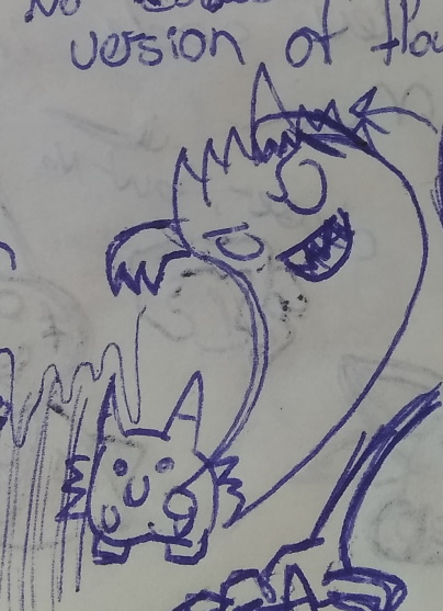
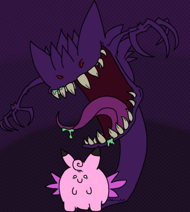
Concept sketches also lets me reconfigure an idea that might not work exactly right. A good example of this is the Gengar drawing from my last Pokemon doodle post. Originally it started out looking like this:

The final version is much different. I knew I wanted to draw Gengar as Clefable’s shadow, but these original drawings put far too much emphasis on Clefable. Eventually I remembered the fright jar from Paper Mario. This item caused a giant shadow of Bowser to appear behind the character. The shadow completely grabbed the focus of the frame. Perfect. That idea looked as follows:
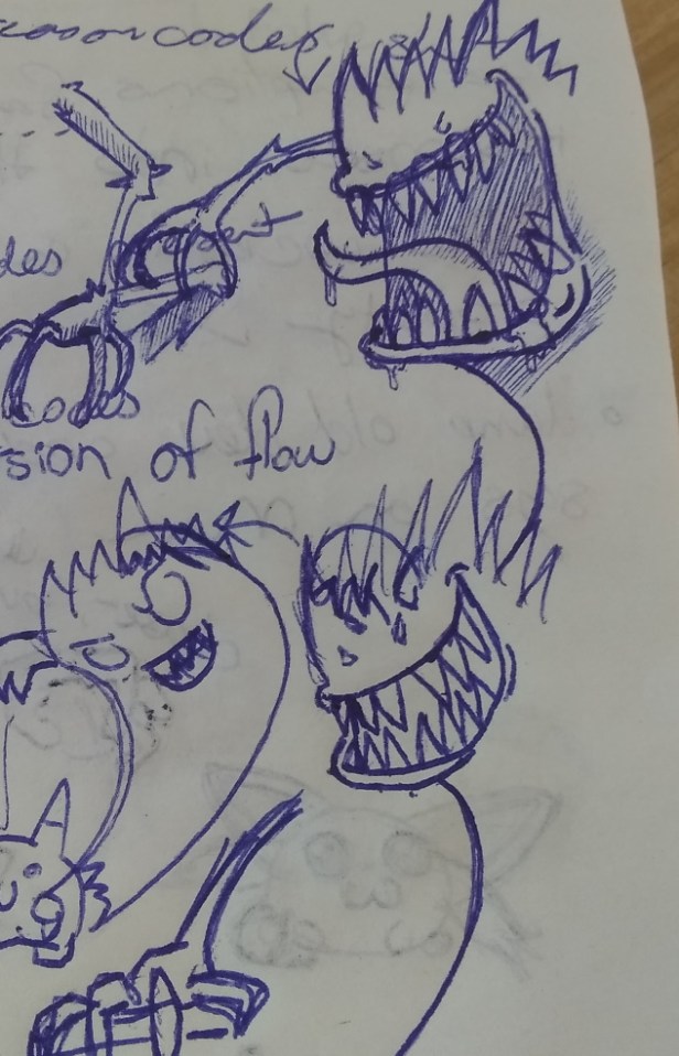
And then I got more weird with it, which resulted in these other concept sketches.
Also all the creative work I’ve consumed over my life has a chance of being referenced in my work. Much like the fright jar, it is very easy to incorporate things knowingly, or unknowingly, into your own creations. I’m sure some of you have thought, “hey this reminds me of such and such thing”, and that may very well be because it is loosely based on it.
Step 2: Digital Sketch
Alright. Now that I know what I’m drawing it is time to start a digital sketch. If I didn’t do all my drawings with a mouse I’d be more inclined to just do my concept sketches on the computer, but a mouse doesn’t give my hand the full range of motion a pen does. As such I do my experimentation in the physical realm, and only venture into the digital one once I understand what I’m creating.
Using my concept sketch as a reference I’ll create a sketch of what I’d like to draw on my computer. Because it is just a sketch I’m never concerned with the overall quality. Lines can be weird, or extend too far. Frankly the whole thing can look like visual diarrhea. The important thing here is that I have a rough idea of what I’m drawing, and how big it is.
For anyone looking to get into digital art, I’d recommend doing this if you don’t already. Creating a rough sketch can help you work out issues in your drawing before you commit to the final draft. It’s a lot easier to resize something, or adjust a part of a drawing that doesn’t look exactly right when you can draw over everything.
Step 3: Inking/Outlining
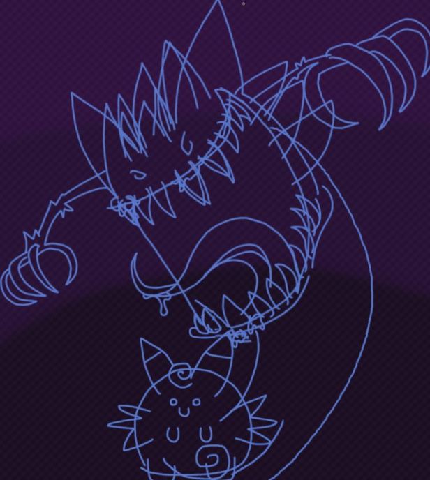
It isn’t really inking because it is digital art, but we’re now ready to take our sketch and finalize the lines. Here I turn up the darkness on my blue sketch colour until it is a nice dark grey.
Unlike the previous step all of these lines are going to be visible in the final drawing, so I have to make sure everything looks just right. Because of that there is a lot of ctrl+z’ing in this stage of the drawing. This is also where I’m able to over-correct something I don’t like. Using the Gengar example again, I really didn’t like how the teeth looked in the digital sketch, so I sharpened and made them thinner.
Another example would be the Squirtle I drew. Here I went from it having a huge head, to rounding it out and correcting the jaw so it aligned better with the water it was barfing.
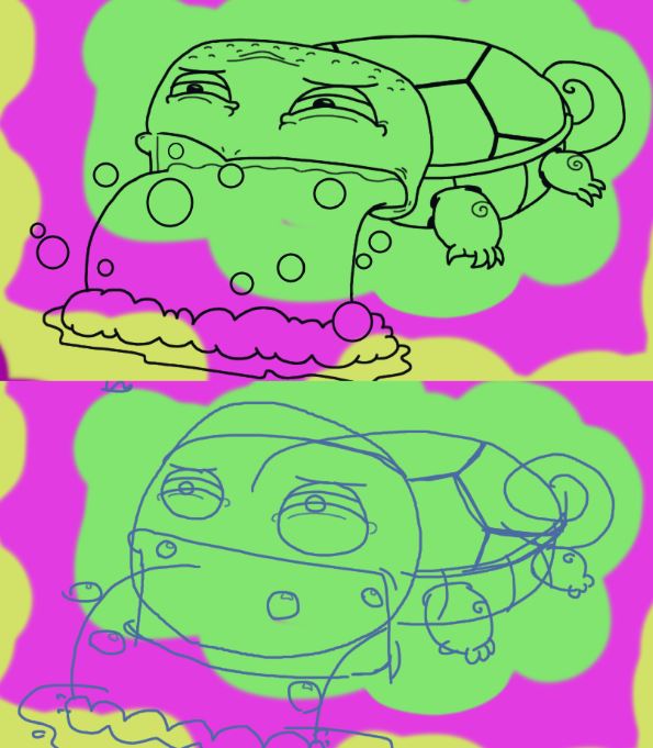
A lot of thought goes into making these monstrosities.
Also, we’re drawing all of these lines on a new layer. That’s important as it locks all of the line art to it’s own special plain. This also means I can disable the visibility of the sketch layer, so it isn’t present in the final product.
Step 4: Colour
I have always hated colouring things. I find drawing fun, but colouring is incredibly tedious. I know some people really enjoy colouring, but I want it to be over as soon as possible which ends up making me very anxious.
Colour selection is pretty easy when you are creating something based on source material. I choose colours that I think are close to what they’re supposed to be and use those. If a particular colour doesn’t quite look right I’ll choose something different on the colour wheel and use that. There is a lot of retrying in this step. Eventually I’ll settle on the colours I like and will colour in the drawing with those.
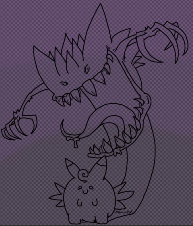
For colouring I create another layer, which I place under the line art. This will let me colour up to and under the line art so there is no gaps in colour at the edge of the drawing. That’ll take a drawing that is just lines and turn it into a drawing with colour:
And this is what the colour looks like without the lines to provide context:

Step 5: Shading
And now for the final step: adding shading to create the illusion of depth. I think I’m pretty terrible at doing this, but I’m slowly improving.
For this step I add yet another layer and decrease the opacity of the layer. This will make all the colours transparent, which allows the base colour to bleed through. The result is a much better blended look.
As far as colour selection goes, I take the base colour and then move it toward a cooler colour. If it’s red that means making it purple, orange and yellow become dark green, green and purple become blue, and blue goes to a darker shade of blue. I then apply the shadows where I deem appropriate. The trick to this is thinking about the drawing as if it’s in a 3D space adding shadow where appropriate. That’ll make everything appear to have depth even when there isn’t any.

I also occasionally add highlights using a similar approach, but they seldom look correct. That’s a skill I’m still trying to work on, mostly with unpublished art.
So that’s the long, detailed explanation of how I make art. I hope that was informative and interesting.
Also, new art post is coming this month. Still working on some doodles for it. Hope you will all enjoy those.

That was super interesting. I really think I learned something today.
I especially like how Clefaible started out looking rather happy with just a Gengar-shadow, and started looking terrified as soon as the second physical sketch! 🙂
One question, though: Between steps 2 and 3, do you add a layer on top of the digital sketch and then “redraw” it over the original sketch? Sorry if this sounds stupid, but I have absolutely no idea about drawing, even less so on a computer.
LikeLiked by 1 person
Thank you.
Yeah every step (on the computer) is on, minimum, one new layer. So basically I’m just tracing over the sketch on “invisible” tracing paper.
Also notable: certain drawings have additional layers for different parts of the sketch, or for specific visual effects. Ex. Espeon’s eyes in the first post are made up of like…3 layers I think. One of the drawings I have coming out in the next Ruining Your Favourite Pokemon post has 20-25 layers. That sounds ridiculous until you see how…involved it is.
I’m also pretty sure most people with more practice and artistic working talent than I have make better use of layers than I do hahaha.
LikeLiked by 1 person
I love your wacky Pokemon art! Can’t wait to see more! 🙂
LikeLiked by 1 person
Thank you.
Hopefully there will be some more in the coming weeks. I bit off a bit more than I could chew with the latest batch. Lessons were learned. Specifically in relation to not using giant canvases when you do all your drawing and colouring with a mouse.
LikeLiked by 1 person
Whoops! Good luck powering through! 🙂
LikeLiked by 1 person
Shading’s the worst though. I can never get it right whenever I use colored pencils. It’s less tedious in pixel art, but with everything else, it always turns out wrong for me
LikeLiked by 1 person
Practice makes better. 🙂
I find digital art tutorials on youtube are helpful for teaching me new tips and tricks for getting things exactly right.
The other thing I like to do is try to think about the drawing like it is 3D instead of 2D. That’ll help to contextualize the lighting, so I have a better idea of where it should hit and shouldn’t hit. Sometimes I think I do a good job. Other times…
Well let’s just say it’s a good thing that I don’t leave my own critical comments of my art on my blog for everyone to read. XD
LikeLiked by 1 person
Thank you for the tips, I’ll try my best
LikeLiked by 1 person