
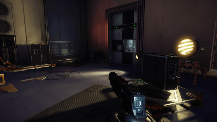
Do any of y’all remember that article where I expressed my frustration with Prey’s Nightmare enemy? One of the primary factors for this was how the game’s user interface undermined the tension that naturally should have accompanied being hunted by an apex predator. Whenever an enemy knows where the player is, their health bar becomes visible above their head. In many cases this clearly illustrates where players need to aim their gun, which is good. However, when an omnipotent gigachad spawns 4 rooms over with a giant marker over their head, the player is very immediately given too much information which robs the situation of any build-up and release.
Despite my issues with Nightmares, I enjoyed Prey well enough, and this could have been where my journey with it ended. However, I decided to grab the Mooncrash DLC during the Steam summer sale. I’d heard a lot of good things about it, and was curious if I’d enjoy it as much as I did the base game. Though, before I began, I made a change that I believed would improve my play experience by turning off almost all of the UI. And you know what? I had a really good time. In fact, I think I enjoyed Mooncrash more because the lack of information forced me to engage quite heavily with the game’s systems. It also injected that tension that I craved transforming the whole experience into a ruthless gauntlet of survival. As such, I wanted to examine the specifics of how a lack of information positively impacted the way I approached Prey.
The first major change from my previous experience with Prey relates to feedback. Health bars tend to dominate the user interface in many games for a reason. They clearly communicate the constitution of any given foe, and inform players about how effective their attacks are. Did you take a swipe at the giant alien only to see a tiny pip of its health disappear? Well, you better start running cause you just pissed it off, and don’t stand a chance of beating it.
Without the immediate feedback of health bars, one would assume that I’d have been flying blind throughout my time with Mooncrash. That wasn’t the case however. I never noticed it on my first playthrough, but the visual design of Prey does a great job of supplementing the feedback that health bars normally provide. This visual design is a lot more subtle than slapping the information right in your face, so it’s largely overshadowed. As an example, when an enemy takes a particularly large amount of damage they flinch, and lose their footing. You don’t need to see their health to know that was a critical strike because the enemy’s movement has already communicated as much.
Prey isn’t even the best example of this kind of feedback: Monster Hunter is. Never ever has Monster Hunter included health bars for the creatures you’re fighting. The developers have always made a point of using highly detailed animations as a substitute. Monsters will flinch after heavy hits, will struggle to use broken wings, and will limp back to their hidey holes when they’re low on health. On the flip side, if you attack a shell or hardened carapace then your weapon will bounce off the monster unceremoniously with a metallic clang. All of these visual cues help to clue the player into how effective they’re attacks are in ways that feel far more immersive.

Along with being more immersive, combat also became more deliberate thanks to the lack of information. It’s pretty easy to do the mental math to determine if you’ve got enough bullets to take down whatever you’re shooting at once you see how much damage a single shot does. What happens when you can’t make that determination though? In my escapades, this resulted in far more scenarios where I had to carefully consider each altercation. There were numerous times where I deemed a slow stealthy route, or otherwise setting up some kind of distraction to be the superior option. Without perfect information, there’s a lot more risk attached to throwing yourself into combat.
Being more selective about when I’d fight wasn’t the only thing that changed though, as I also got more creative with how I approached combat. There was this time I ran into a hulking metal harvester while low on pistol ammo. This enemy type is fairly resilient to bullets, and I was already low on ammo. A brute force approach wasn’t going to work, but I needed to defeat it to access the escape pod located in the room. I skulked around for a bit eventually finding an alternative solution to my problem: gas canisters. A couple explosions would surely suffice where my pistol could not. So I stacked a couple up, lured the harvester over, and shot them. Its corpse exploded across the room, while I wheezed having nearly been killed myself. Still – the plan worked! Nice.
The final area where lacking information was greatly enhanced was stealth. I’m not talking about the player sneaking around though – I’m talking about when enemies got the drop on me. Without a bunch of eye piercing UI elements, Prey is a hell of a lot more frightening. Whenever an enemy has spotted the player, an ear piercing note plays to alert them. However, that sound effect became infinitely more terrifying when I wasn’t told where the enemy was located. This was made even worse when dealing with mimics, and phantoms where the former can blend into the environment, while the latter is permanently cloaked. These enemies were trivial to deal with when they were given away by their health bars, but were downright terrifying without them.
Mooncrash also introduces a couple of its own wrinkles into the mix as players hit the late game. There’s a chance for a vision obscuring dust storm to happen in the central hub area, which makes navigating it tremendously risky. This area is mostly open, and always contains high leveled enemies. You’re at a massive disadvantage when navigating this space normally, so the addition of a visual impairment makes it pure terror to explore. The effectiveness of this cemented itself for me as I was making a bee-line while I could hear very angry screams echoing behind me. It only gets worse when Nightmares begin spawning in this same area, which finally gave them a legitimate claim to their name.

I’m not sure I’ll have changed anyone’s minds, but I still can’t believe how different my experience with Prey was when playing with a reduced user interface. So much more of the game’s intelligent visual design was able to shine through when it wasn’t being choked out by health bars. Additionally, a lack of information gave me far more opportunities to engage with all the different systems Prey has on offer. Plus the entire thing was far more tense, which helped me to really stew in the experience. I know it won’t be for everyone, but I’m convinced that there are games where less might be more when it comes to UI.

As with most other things in regard to immersion, I simply don’t get enough out of the tradeoff that you do .
Less information handed out to the player is usually the worse experience, even in the world of Elden Ring memes about Ubisoft.
It’s a feeling thing for most part, as I’m sure you would have come up with the gas canisters even with the UI on… But because it’s now off it feels like a greater personal accomplishment.
But you already knew my answer here, as you know how I also feel about exploration in games
LikeLiked by 1 person
Absolutely no surprises there
Thing is – I’m pretty sure people like you are in the majority, which is why all this stuff is on by default. Still tho – I do like that it was an option, so I think I’m going to seek out said option in future titles 😛
LikeLiked by 1 person